- Client The Planet Group
- Format Social design system
- Role Concept, design
- Year 2026
Same message. Different impact.
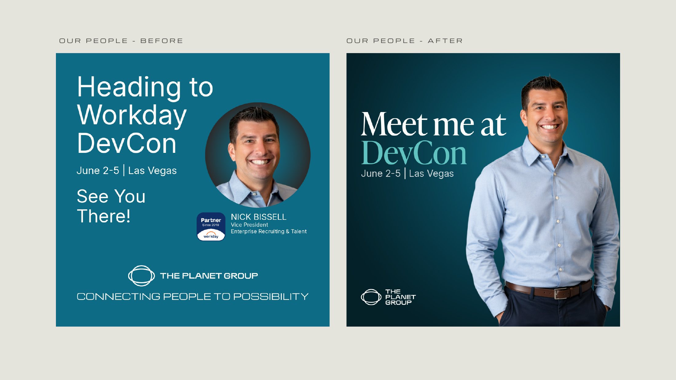
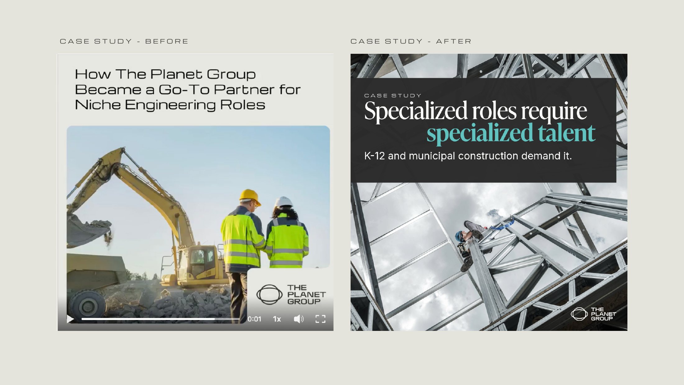
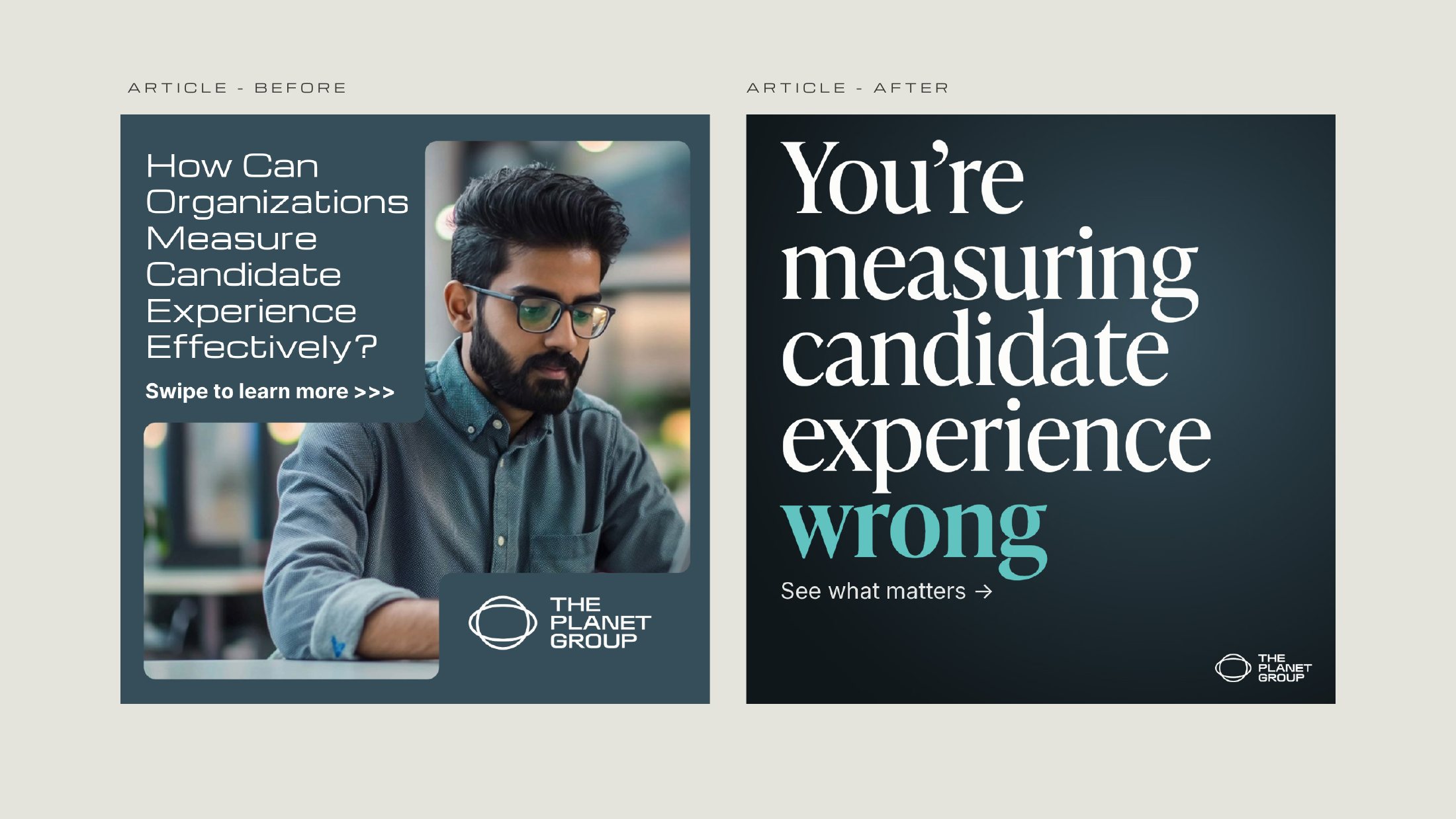
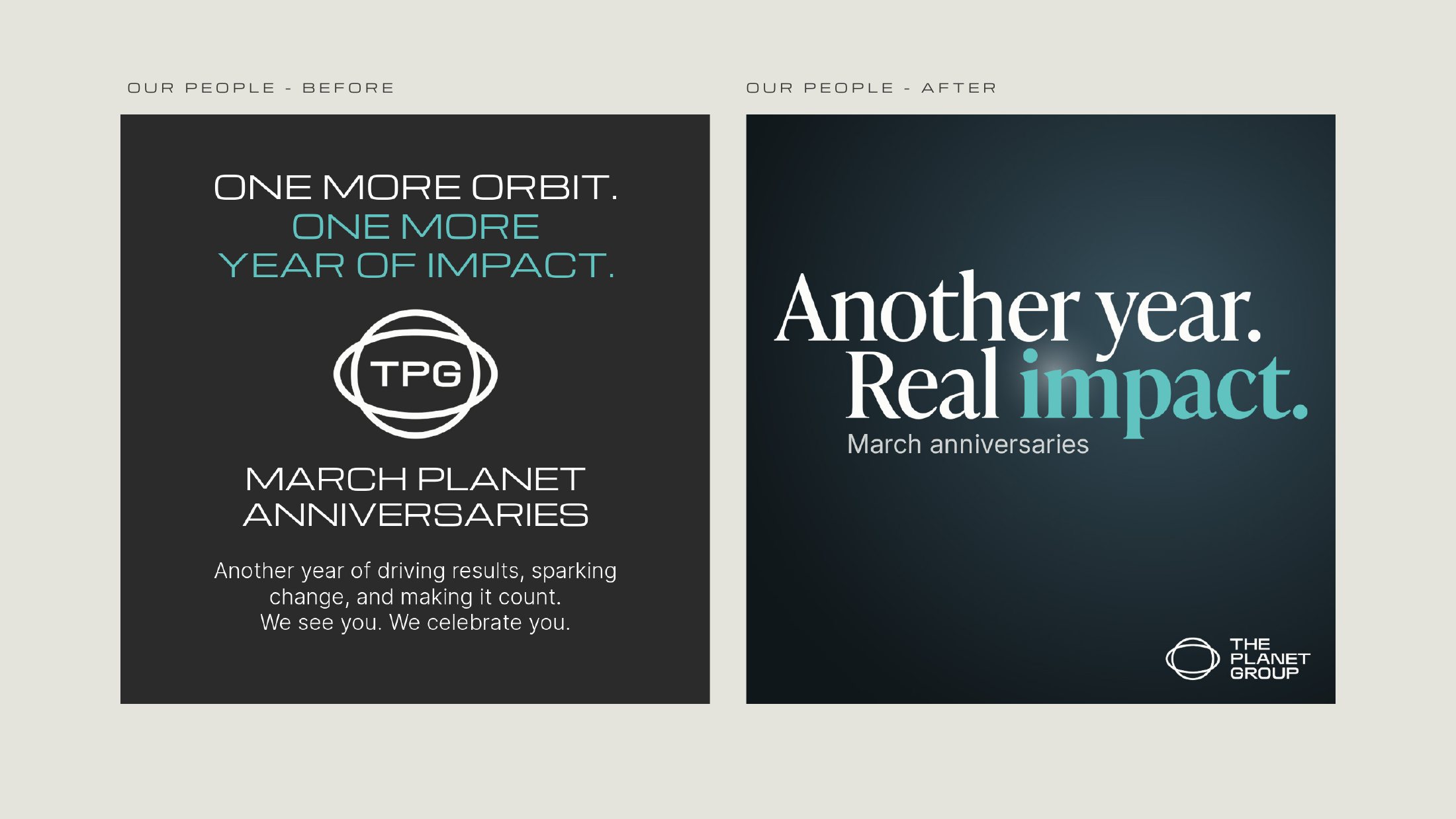
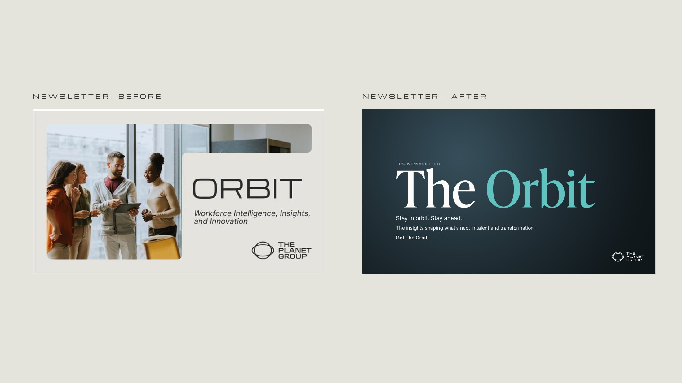
After a year in market, TPG’s social posts were clear but forgettable. I rebuilt the system so every post earns attention in the second it gets.

The diagnosis
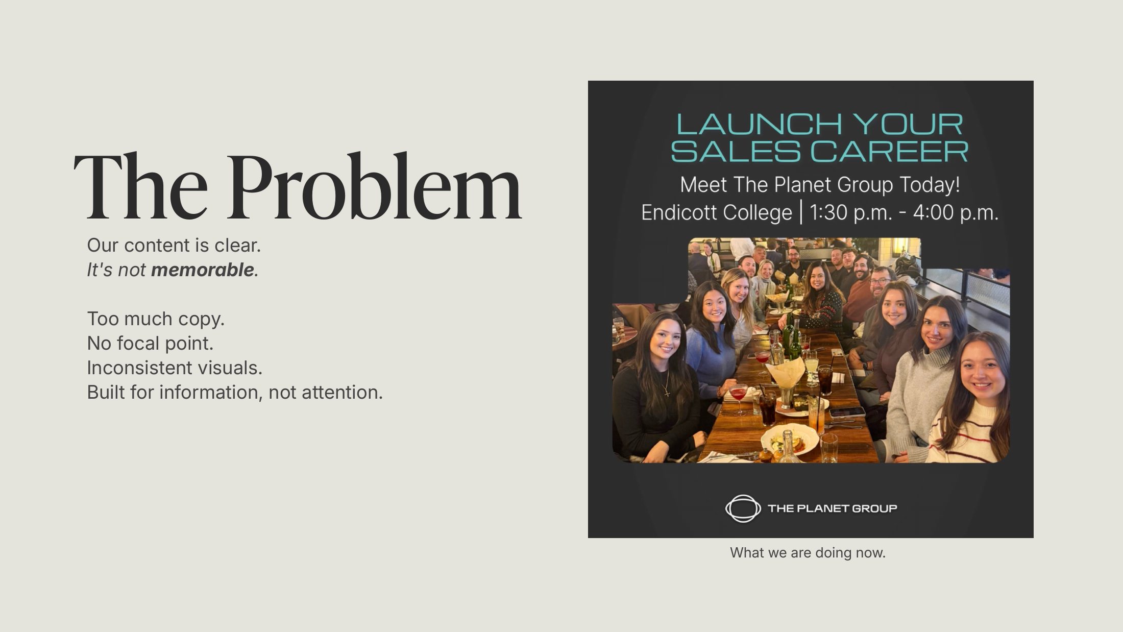
Clear, but not memorable
Too much copy, no focal point, and inconsistent visuals. The brand’s wide display face was distinctive but hard to read at scrolling speed, and cut-out photos looked flat and dated.
The system
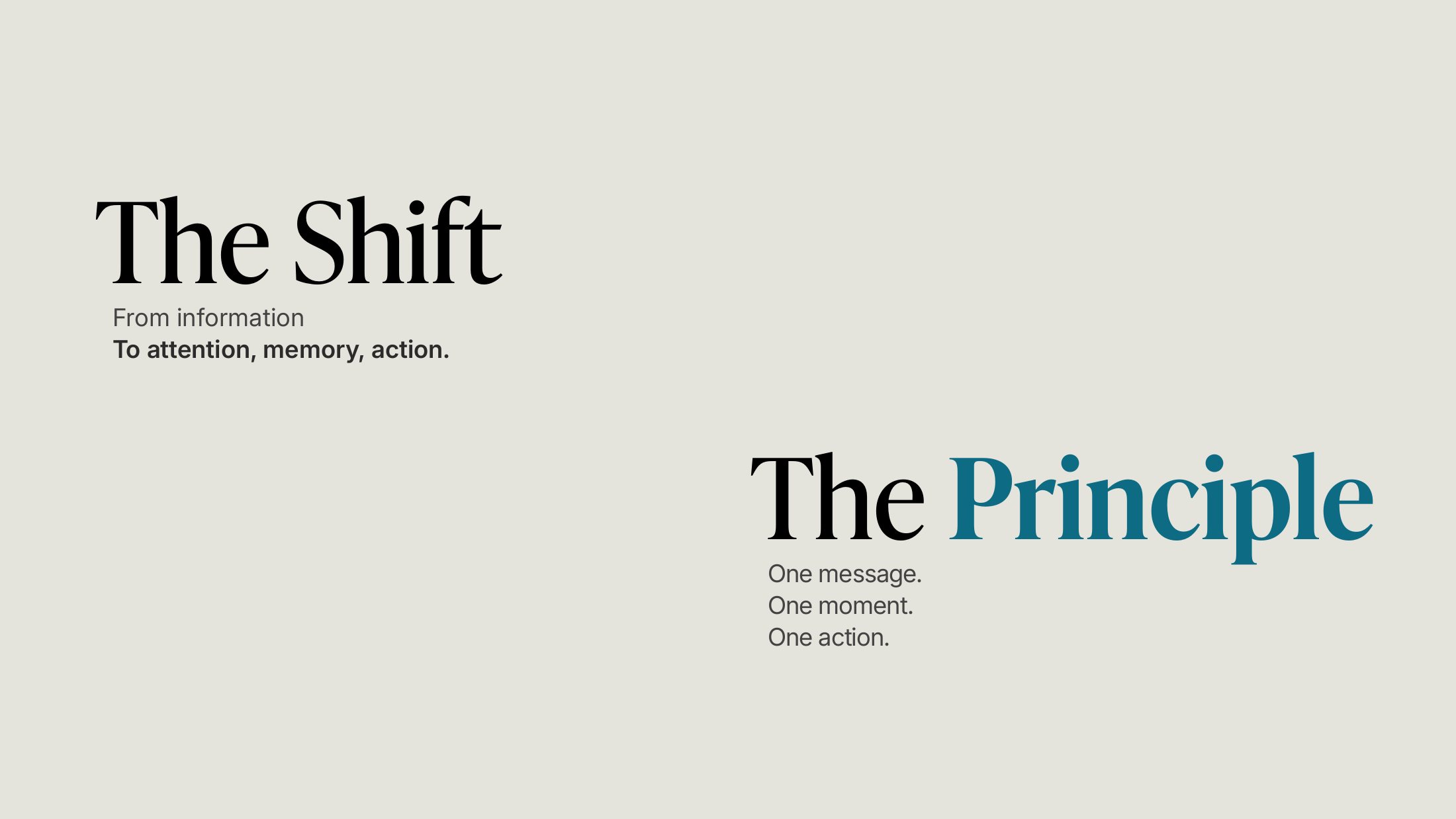
One message. One moment. One action.
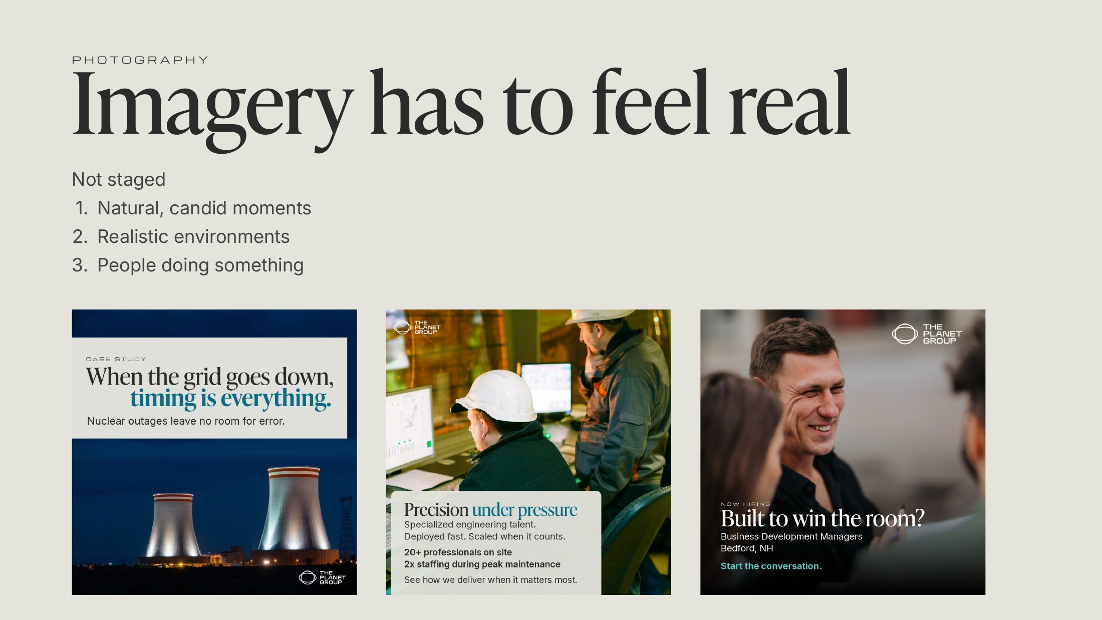
A single serif headline face in sentence case, the wide face kept only for small eyebrows, Inter for body copy, and full-bleed photography of real people in real places. Every post gets one idea.
I wrote the rules as a guide the whole team could use, with design routed through Creative so the standard holds.
Before and after, same content